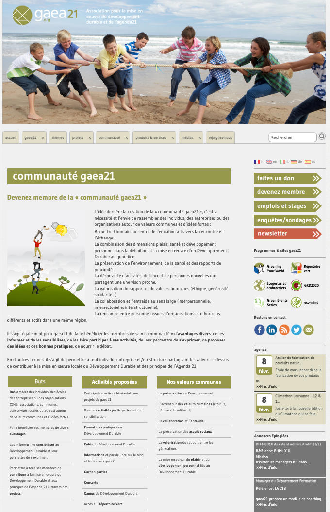
Fig. 01 — Original website, dense layout with competing visual elements.
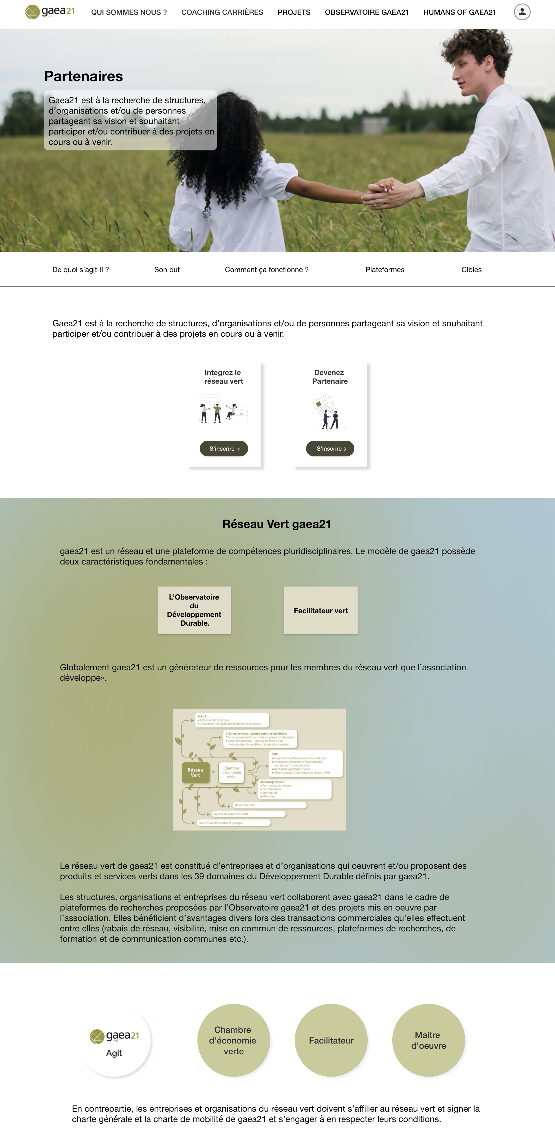
Fig. 02 — Redesigned site, cohesive identity with reduced cognitive load.
GAEA21 is a non-profit association under Swiss law that pursues an ideal social goal: implementing sustainable development and Agenda 21.
It operates as a vast network of skills and a think tank that introduces the participatory dimension of the public at the heart of its action. The brief was to redesign the website, create a better user functionality experience, rebrand the site to improve the overall look and feel, and increase the conversion rate — addressing both quantitative engagement metrics and qualitative perception of the brand.
I worked on several interrelated factors: consistency, color (using one dominant color across the site, supported by complementary tones), typography, imagery, simplicity, and functionality. Together those decisions produced the redesigned site.
At the macro level, two changes carry most of the impact of the redesign.
First, a cohesive brand identity that makes every page look like part of the same product. Each page was designed with the same structure, the same component vocabulary, and the same color system — so a visitor moving from the homepage to a programme page to the partners section never has to relearn the interface.
Second, a deliberate reduction in cognitive load. By stripping away non-essential features and options, the redesigned site avoids visual clutter and asks the user to make fewer decisions per screen. The result is a site that feels lighter without losing depth.
Fig. 01 — Original website, dense layout with competing visual elements.
Fig. 02 — Redesigned site, cohesive identity with reduced cognitive load.
The more options a user has, the more time it takes to decide — Hick’s Law in practice.
The original site presented too many concurrent choices on every page, leaving visitors to filter information themselves before they could act. A comprehensive eye-tracking study by the Nielsen Norman Group shows users tend to follow the F-Pattern when scanning pages online: first they read the headline, then a few points below it, then the first sub-heading, and from there they barely scan downward to see whether anything is useful. Content that lives outside that visual path effectively doesn’t exist.
The original site had almost no breathing room — an issue that quietly suppressed readability.
Whitespace isn’t empty space. It creates harmony, balance, and brand recognition; it leads a reader from one element to the next, boosts readability, and guides the eyes through the content in the order intended.
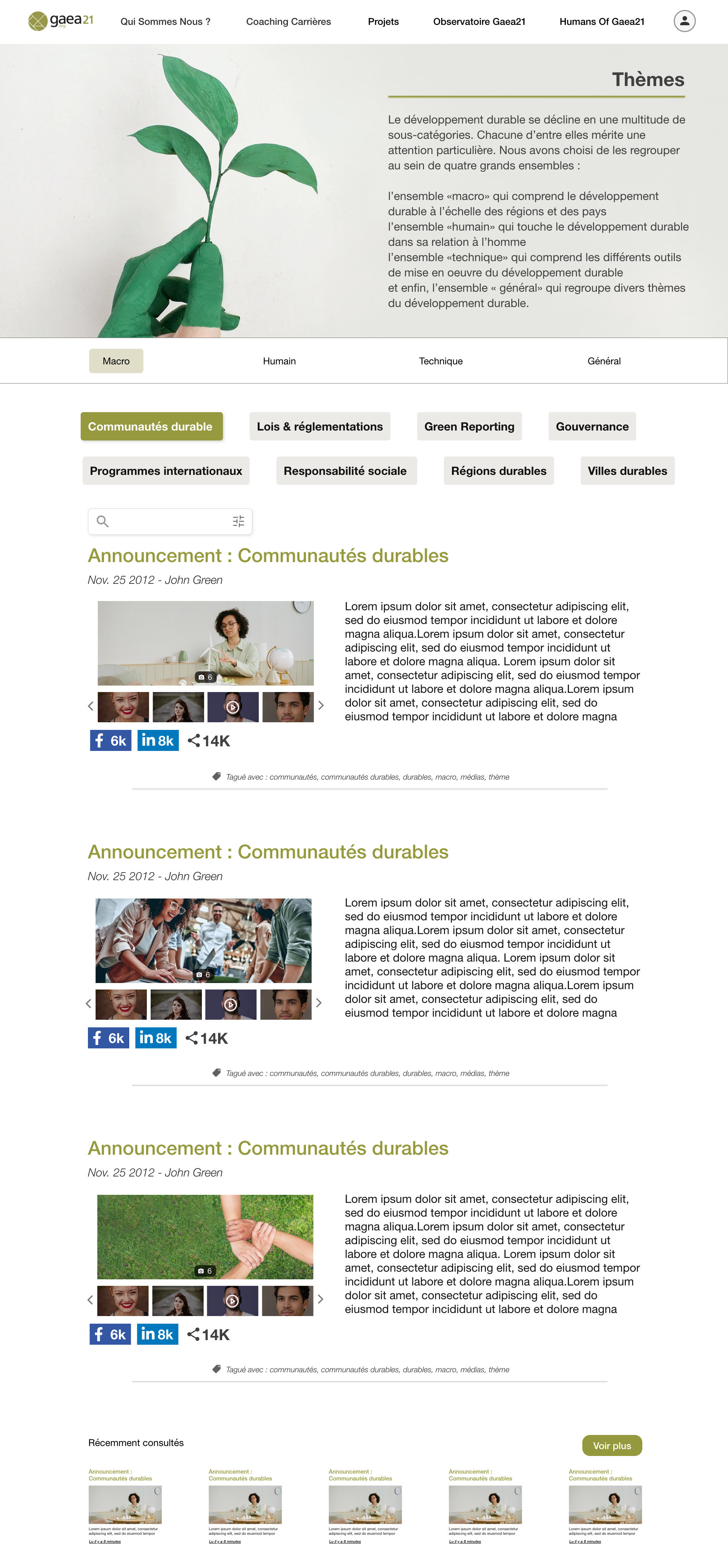
Fig. 03 — Final design, dominant green palette and editorial spacing.
Two related problems shaped the rest of the redesign — the F-Pattern reality, and the need to eliminate unnecessary steps everywhere.
The F-Pattern study from Nielsen Norman Group means anything on the right side of a long page receives almost no attention. The redesign placed every action and every key message inside the left-and-top visual path. Simultaneously, the user-flow audit identified every redundant click in the original site and removed it — every step a user takes, no matter how small, makes a difference.
After launch, three shifts became visible across the analytics surface and the qualitative feedback from the team.
The unified brand identity is now consistent across every page — previously, navigating between sections felt like visiting three different sites. Cognitive load on the homepage dropped: time-on-page increased and bounce rates from organic search fell, both signals that visitors are scanning content with intent rather than leaving in confusion. The clearer information architecture meant that the team’s sustainability programmes — Réseau Vert, Say it out Loud, the partner network — finally have visible homes that people can find and share, rather than living three clicks deep behind a noisy navigation.
“A non-profit doesn’t fail because its mission is unclear. It fails because its website is.”
GAEA21 was the project that taught me how much of UX research applies independent of vertical.
The same principles that govern fintech dashboards — Hick’s Law, F-Pattern scanning, whitespace as structure, eliminating effort — apply directly to a sustainability non-profit, a wine cellar specialist, or an AI platform. What changes is the editorial register, not the underlying mechanics. Once those mechanics are taken seriously, even a small non-profit website starts to feel like a product.
The second lesson was about restraint. Non-profits tend to want to communicate everything they do at once, on every page. The redesign worked because we said no to that impulse — one dominant color, one structure per page, fewer options at every decision point. Less, designed well, did more than the original site ever did.