Objettiva is a Geneva-based wealth management firm that runs the daily financial planning for high-net-worth Swiss clients and their accountants. Their original platform — built in legacy Java — was the operational core of the business.
It was also the bottleneck. Critical features had stopped working. The flow between accountant and client was fragmented across disconnected screens. Financial terminology drifted from one module to another, so two people looking at the same portfolio could read different numbers and not know it. And the interface still relied on embedding raw Excel sheets directly into the platform — a workaround that had quietly become the product.
In a city built around private banking, this product was Objettiva’s entire client-facing surface. The visual and functional gap with the rest of the Swiss financial industry had become a business risk.
I was brought in to lead the redesign end-to-end: research, UX architecture, visual system, and the front-end implementation in React.
The scope was deliberately open. There was no design system, no UX precedent inside the company, and no working documentation of the legacy platform’s logic. The brief was simple in writing and complex in practice — turn a tired Java tool into a product that Swiss accountants and their clients would choose to use.
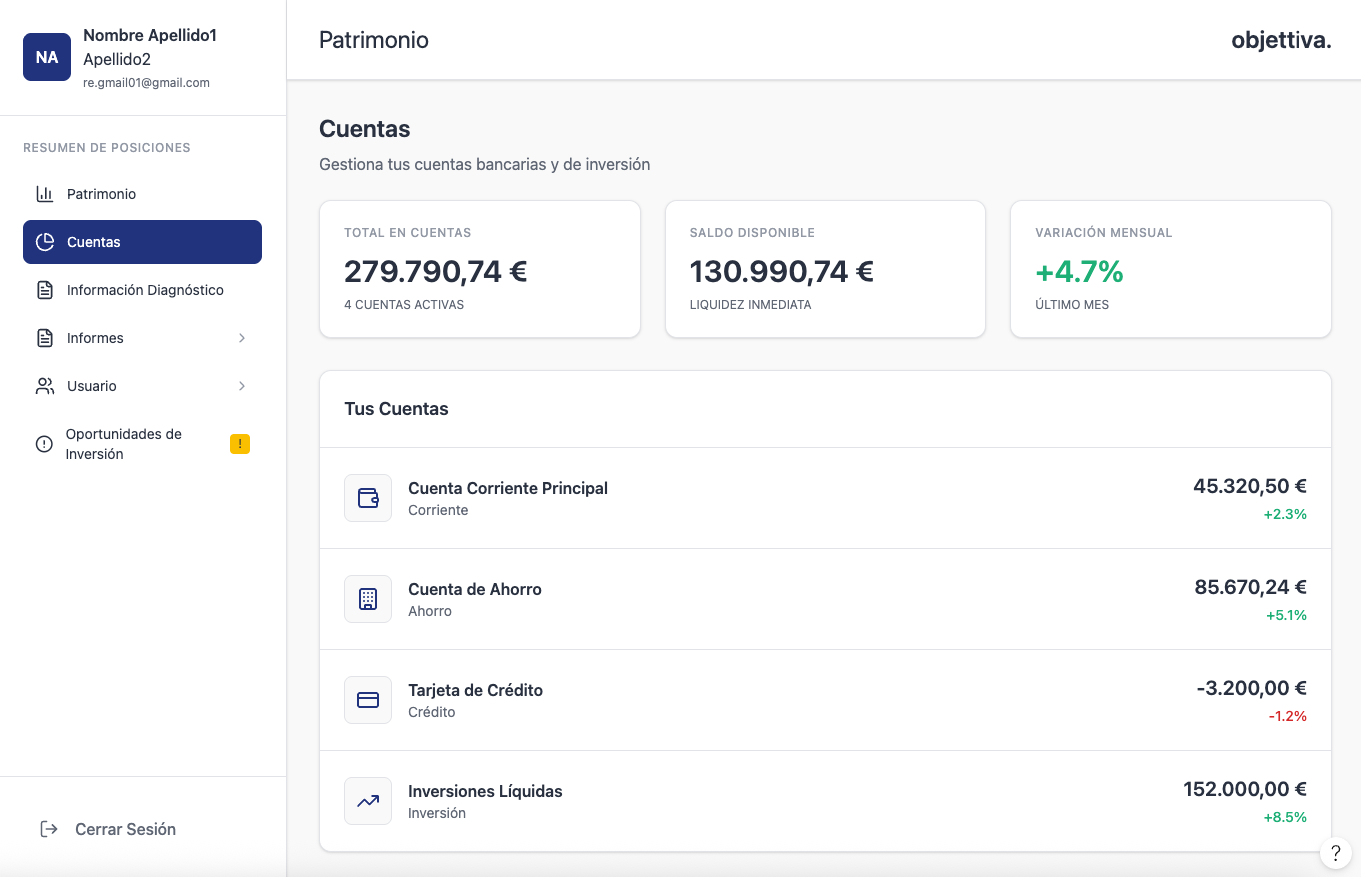
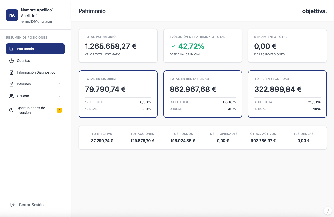
Fig. 01 — Client overview, default view for Objettiva accountants.
The first phase was conducted directly with the people who used the platform every day — Objettiva’s in-house accountants and a sample of their clients.
I ran structured interviews and observational sessions during real client reviews, mapping the steps each user took to complete recurring tasks: producing a wealth report, reconciling assets across accounts, sharing a planning document with a client. The output was a clear picture of where the workflow broke down, which terminology was inconsistent, and which Excel-driven workarounds had become quiet dependencies.
Two findings shaped every later decision. First, the accountant and the client were treated as a single user by the old system, even though their needs are fundamentally different: one builds the data, the other reads decisions out of it. Second, the financial nomenclature used inside the platform diverged from Swiss industry conventions — making the product feel amateur to the very audience it was supposed to serve.
Before any screen was drawn, I rebuilt the information architecture and standardized the financial vocabulary across the platform.
I defined two parallel flows — an accountant workspace and a client workspace — that share the same underlying data but expose it through different lenses. The accountant view prioritizes data entry, asset reconciliation, and document production. The client view prioritizes readability, comparative summaries, and trust signals: clear sourcing, version history, and consistent terminology.
The taxonomy work was, in many ways, the most important deliverable. I aligned every label, category, and report header with Swiss wealth-management conventions so the platform reads correctly to anyone in the industry. Excel embedding was retired and replaced by native modules — tables, charts, and reports that follow a single visual and editorial standard.
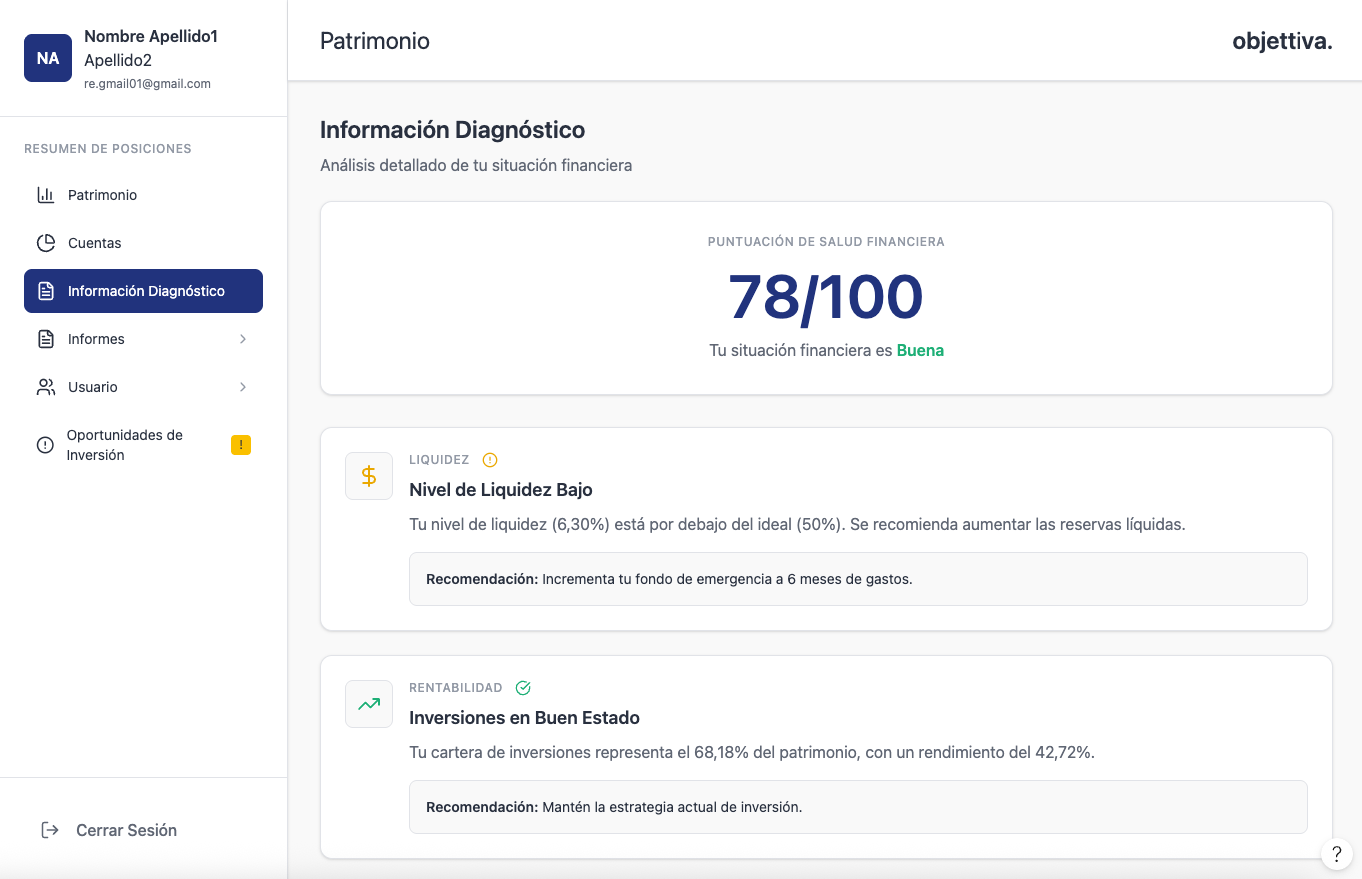
Fig. 02 — Accountant workspace, asset entry and reconciliation module.
Fig. 03 — Client workspace, wealth overview and planning view.
I designed the full visual system in Figma — typographic scale, color tokens, table behavior, chart conventions, document templates — and then implemented it in React on the production front-end.
The system is built for dense financial data: monospaced figures for numerical alignment, accessible contrast across every state, a quiet palette that lets data lead, and components designed to scale to thousands of rows without losing legibility. I made every front-end decision with one constraint in mind — the people reading these screens are making decisions about real client wealth, and the interface has to disappear into the data.
The product has been gradually rolled out to Objettiva’s internal team and a first cohort of clients, with each release informed by usage observations from the previous one.
The redesigned platform is now the default daily tool for Objettiva’s in-house accountants, and onboarding for first-cohort clients has begun.
Three measurable shifts followed the rollout: time-to-produce a wealth report dropped substantially against the legacy Java baseline; the dependency on embedded Excel sheets has been retired across every reporting flow; and client-facing communication is now generated directly from the platform rather than reformatted manually. The design system built for Objettiva has also been earmarked for two adjacent internal tools at the firm — the longest-lived asset of the redesign is the component library, not the launch screen.
“The job wasn’t to modernize a Java tool. It was to make Objettiva’s software belong in the same conversation as the rest of Swiss private banking.”
Redesigning a financial product taught me that the visual layer is almost never the real problem.
The hardest part of Objettiva wasn’t the interface — it was the years of compromises encoded in the legacy product and the divergent vocabulary that had grown alongside them. The redesign needed a structured editorial pass on language before it could become a structured product. Once the taxonomy aligned with the industry, every design decision downstream became easier and faster.
I also learned to design the rollout, not just the product. Migrating active clients from a tool they tolerated to one they had to relearn was a UX challenge in itself — one that paid back when the first cohort started defaulting to the new platform without being asked.