CréaCave Sàrl is a Swiss construction company specializing in the renovation and bespoke design of wine cellars for private clients.
The brief was multi-layered: redesign the website, refresh the brand around it, increase organic traffic, generate qualified leads, and add functionality that improves the day-to-day user experience — without losing the artisan tone that defines the company in the Lausanne market.
The audit of the legacy site surfaced four structural failures that the redesign had to correct simultaneously — not a list of cosmetic tweaks.
CréaCave’s clients are private homeowners commissioning a four- to six-figure renovation. The old site read as a generic construction company catalogue, when the actual decision moment is closer to commissioning a piece of furniture. The IA and content needed to shift from “list of services” to “portfolio of bespoke installations.”
There was no qualified lead funnel — just a generic contact form at the end of every page. High-intent visitors arriving from search dropped off because nothing in the flow helped them self-select (cellar size, budget range, intervention type).
Website, brochures, and visit cards used three different palettes, two different logos, and inconsistent typography. A premium artisan service that looks unintentional loses trust before the inquiry call.
Heavy uncompressed images, no caching, and a non-responsive legacy template meant the site was slow on mobile — where most regional searches for “cave à vin Lausanne” happen.
Five specific decisions did most of the work in turning the diagnosis into a finished product.
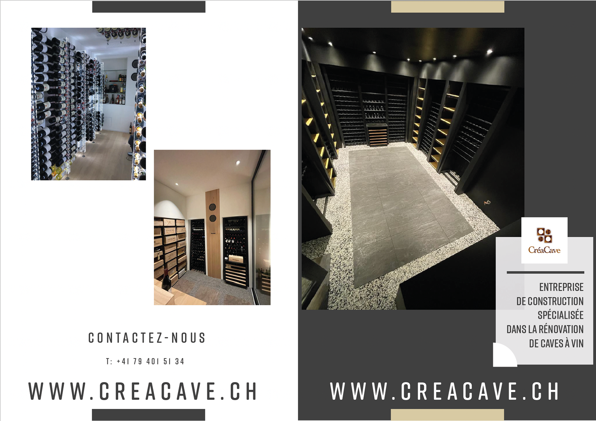
The portfolio of finished installations became the centerpiece of the homepage and the project gallery. Every shot was reframed and re-cropped for editorial layout — treating wine cellars as objects of design, not construction outputs.
Créer · Transformer · Réaménager — the three services CréaCave actually offers — now anchor the homepage and double as primary navigation. Visitors self-select within seconds.
The generic form was replaced by a structured inquiry that captures project type, cellar dimensions, intervention scope, and timeline. The client receives leads pre-qualified, and the visitor feels their request is being taken seriously.
I locked the same palette (deep wine red, off-white, anthracite), the same typography pair (display serif + humanist sans), and the same logo treatment across the website, the printed brochures, and the visit cards. From digital touchpoint to in-hand collateral, the brand reads identically.
Rebuilt for mobile-first delivery with optimized image pipelines, lazy loading, and a responsive grid that adapts cleanly from phone to desktop. The result is a Lighthouse performance score that supports the SEO push.
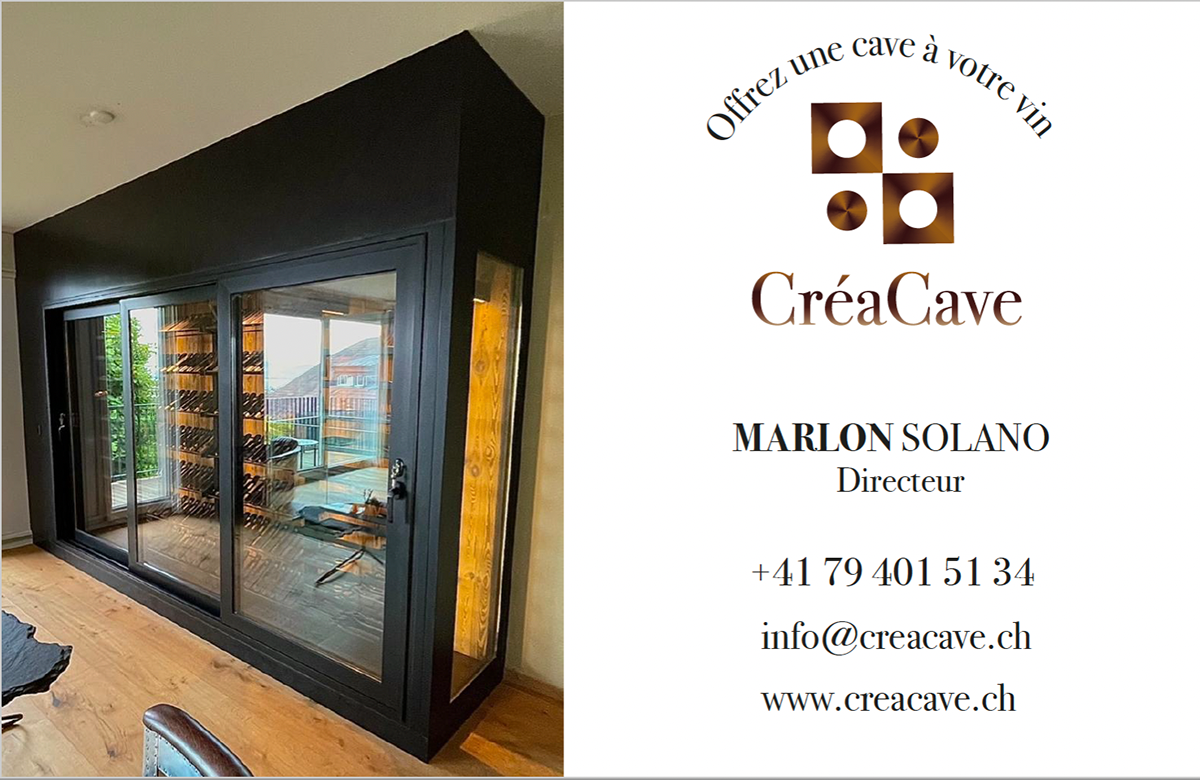
Fig. 01 — Homepage hero. Tagline structured around the three CréaCave services.
Four improvement vectors carried the majority of the impact between the old site and the new one.
Page-speed optimization through image compression, code minification, and caching strategies — with particular attention to mobile, where most first-touch visits originate.
Modern design elements aligned with current trends, a cohesive visual identity for consistent branding across every surface, and a tightly curated set of high-quality images that enhance the overall appeal and showcase finished installations.
A clear information architecture organizes content logically, intuitive navigation menus minimize cognitive load, and call-to-action elements are placed where users naturally look for them — not where the layout has room.
Relevant, engaging content that resonates with the target audience. Key messages communicated concisely. Content optimized for search to improve organic visibility — an essential channel for a regional Swiss specialist.
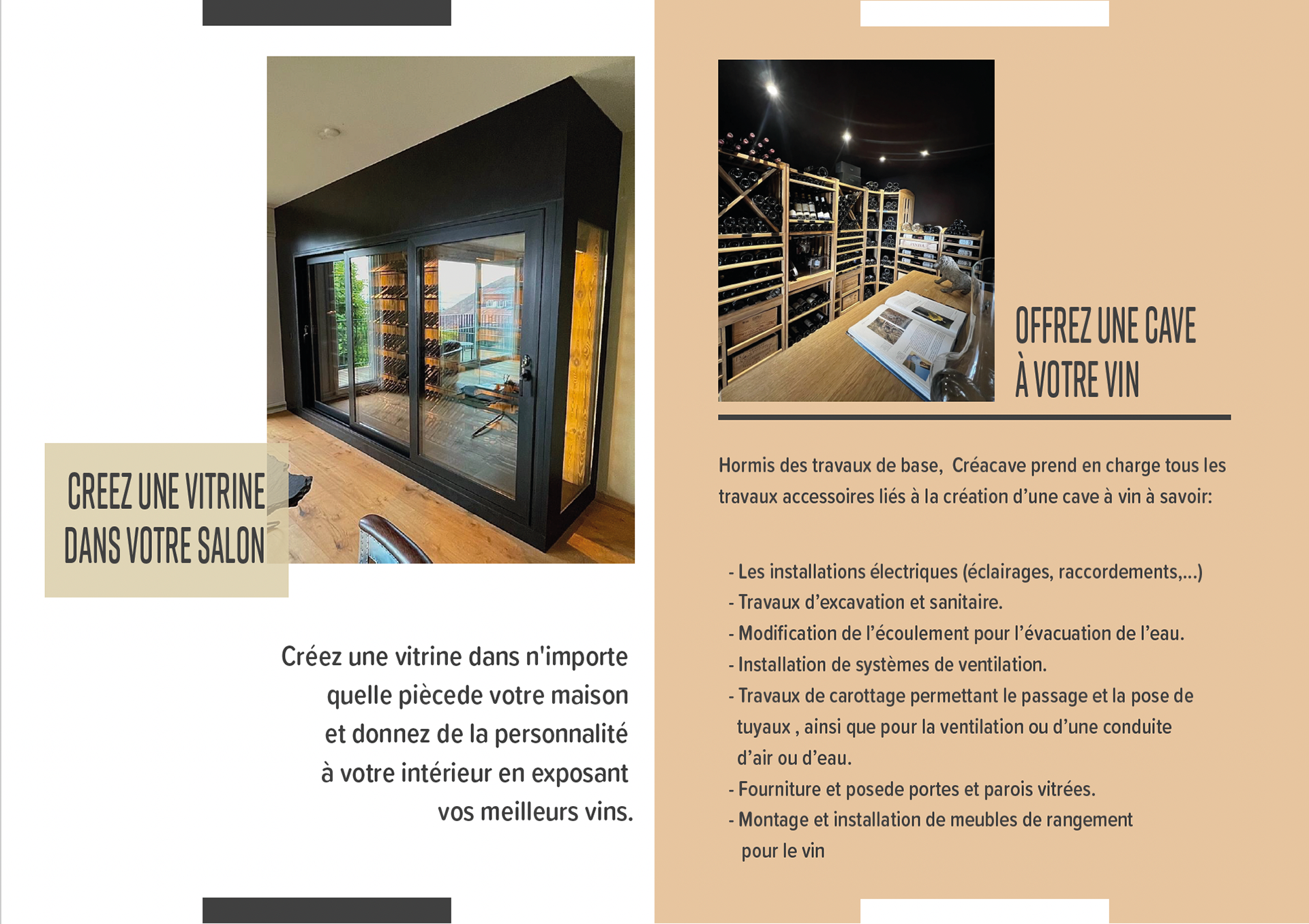
Fig. 02 — Project gallery, finished wine-cellar installations.
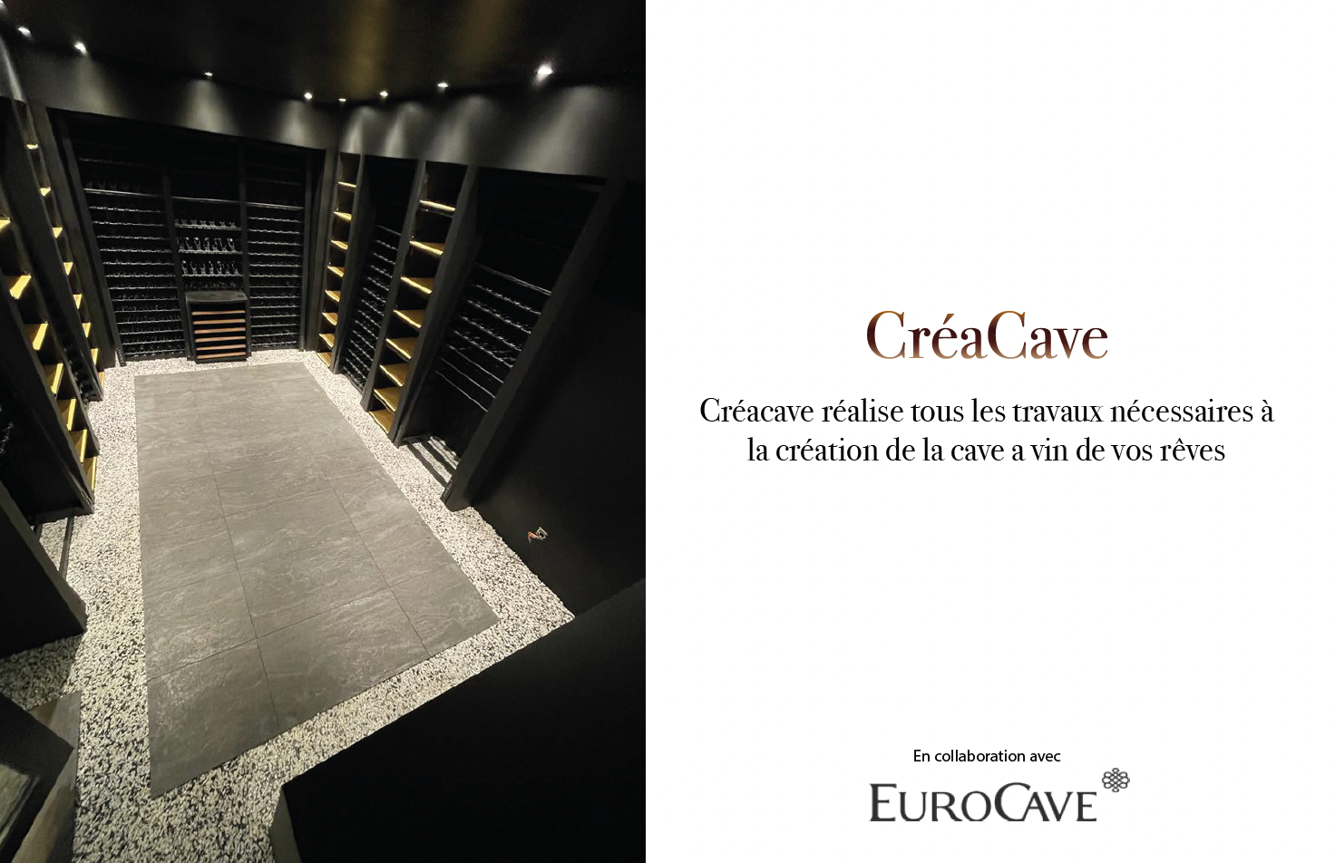
Fig. 03 — Print collateral. Brochure and visit cards designed alongside the digital rebrand.
The main objective of the collaboration was to refresh CréaCave’s identity into something more contemporary, with the website as the centerpiece.
To publicize the company’s services and improve its overall online presence, the project extended into print collateral — brochures showcasing completed installations, and visit cards designed alongside the digital system. The same typography, color, and imagery language carries across surfaces, so a client who arrives by Google search reads the brand the same way as one who receives a brochure in person.
“The redesign wasn’t just a website. It was the brand told the same way across every surface.”
CréaCave was the project that taught me how much value lives in the small details for a specialist business.
For a national brand, the website is one of many channels. For a Swiss regional specialist, the website often is the brand — the first touchpoint, the portfolio, the proof of craft. Treating the redesign as a holistic identity exercise rather than a digital task changed the outcome: every typeface decision, every photograph crop, every brochure spread had to read consistently to keep the brand legible at every scale.