Gestoos Creator leverages the latest image recognition techniques to generate AI models that classify a variety of human behaviors.
The end-to-end platform lets technical teams create custom detection engines that are both high-performance and robust — from raw image data to a deployable model, without leaving the browser. Creator’s users span computer-vision engineers, data scientists, ML researchers, and the product teams that consume the resulting models inside real-world deployments.
The brief was to redesign Creator based on the operational feedback collected from the existing v1.0 platform.
That feedback covered the full spectrum — from technical pain points raised by ML engineers to higher-level workflow frustrations from product teams. The first phase of the project was prioritization: turning the long list of complaints into a structured set of design goals, each one aligned with a measurable improvement target between v1 and v2.
Each of these challenges produced its own set of design decisions in v2.0 — some at the architecture layer, some at the component layer, some at the editorial layer.
User needs & expectations
Creator caters to users with very different roles and responsibilities — computer-vision engineers training models, data analysts curating datasets, and product managers monitoring deployments. Identifying and addressing the distinct needs of each persona — without designing three separate products — was the first structural challenge.
Data overload & relevance
Creator surfaces a plethora of data at every stage of the model lifecycle: datasets, training metrics, model versions, deployment telemetry. Deciding which information is crucial in each context, and how to present it so the user reads meaning rather than noise, drove most of the IA decisions in v2.
Visual complexity
Striking the right balance between comprehensive data and visual clarity was a constant tension. The redesign had to remain visually appealing and easy to comprehend without hiding the technical depth that power users rely on. Every density decision was tested with engineers, not designers.
Consistency across devices
Creator is primarily a desktop product, but teams check progress from tablets and phones during long training cycles. Designing a responsive system that stays effective across screen sizes — without losing the high-information surface engineers depend on — required careful component-level decisions for tables, charts, and modals.
Intuitiveness & user flow
Redesigning to improve the user experience meant rethinking the navigation and the implicit workflow it enforced. v2 reorganizes the platform around the lifecycle of a model — create, train, evaluate, deploy — instead of around the technical modules that backed v1.
Accessibility
Ensuring Creator is usable by users with diverse abilities was a non-negotiable constraint: WCAG-compliant color contrast across the dark dashboard surface, scalable type, full keyboard navigation through long data tables, and accessible state indicators for asynchronous training operations.
Integration of new features
Introducing new functionality — project setup flows, multi-detection support, label management, integrated annotation tooling — while maintaining a seamless and integrated design. Each new feature had to extend the existing system rather than fragment it, so power users didn’t feel the product shift under them.
Successfully navigating these challenges required a collaborative effort grounded in user-centered design principles — iteratively testing and refining each release against real user feedback. The discipline throughout was the same: keep the end users at the forefront, and design solutions that address current issues while anticipating where the product needs to grow next.
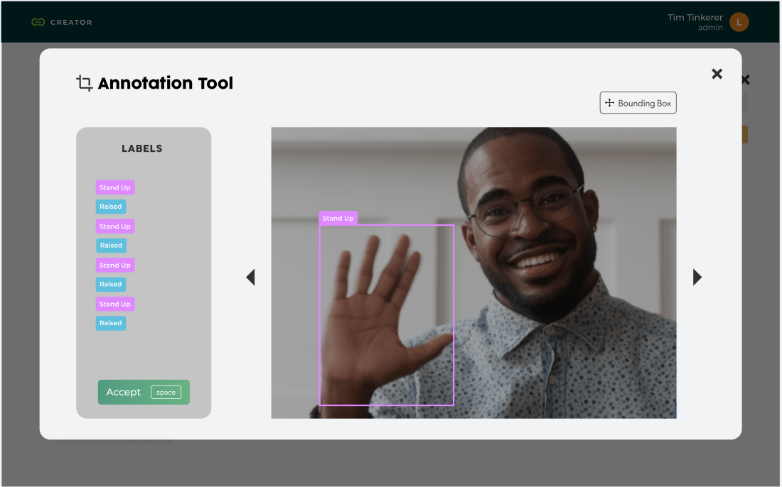
Fig. 01 — v1.0: technical backend, teal branding, data-engineer surface.

Fig. 02 — v2.0: rebranded as Creator, dark editorial UI, product-grade flow.
The v1 to v2 redesign was a category shift, not a refresh.
v1.0 was structured as a technical backend — Data Collections, Jobs, Jobs Queue, Models — with a teal Gestoos identity and an information surface tuned for the team building the AI, not the team using it. Datasets appeared as colored category cards (Driving Activities, Activity Recognition Office), training progress lived inside a jobs queue with raw confusion matrices and experiment logs, and models exported as .h5 files behind a generic data table.
v2.0 reframes the same product as Creator, with a structured navigation around Home · Dataset · My Models. The dark editorial UI replaces the technical backend look. The dataset module is reorganized around Projects and Images, with folder-card thumbnails (Raised Hand Project) showing image counts and last-updated dates. Image info modals consolidate metadata, applied labels (Stand Up, Raised), and the projects each photo belongs to. The training surface is replaced by a clean My Models page showing model ID, performance metric, training mode, backbone, and a confusion-matrix preview — with the export action available inline.
v2.0 collapses what was a fragmented engineering workflow into a clear product flow with four anchor points.
The entry point. Users define the use case by choosing one of three detection types — Activity monitoring (evaluate human activities, individually or in groups, to improve safety in various situations), Gesture detection (train models to detect gestures and create new ways to interact with a product), or Spatial awareness (find objects inside images to count, track, or segment regions of interest). The model type (Image classification, etc.) is selected from a single dropdown, and the project is named in one step.
An import modal lets users select the labels they want to apply (Stand Up, Raised, etc.) before bringing in image data. A dedicated Labels Manager sits alongside the dataset, with edit-and-create flows for each label. Imported images appear in a gallery view with hover trash actions and an info modal that exposes upload date, file name, labels used, and the projects each image is linked to.
A full-screen annotation tool lets users draw bounding boxes directly on images, assign labels from a side panel, and confirm with a keyboard shortcut. The annotation tool is the bridge between raw image data and trainable datasets — designed to be fast enough to scale to thousands of frames without losing precision.
The Train New Model button kicks off a training cycle. The My Models page lists every trained model with its performance metric, training mode (e.g., AutoML), backbone, and a confusion matrix. Each row expands to show base model, epochs, run time, class balance, data augmentation settings, and the actual predictions — with image-level breakdowns of where the model was right and where it was wrong (Label vs Prediction). Models export with one click.
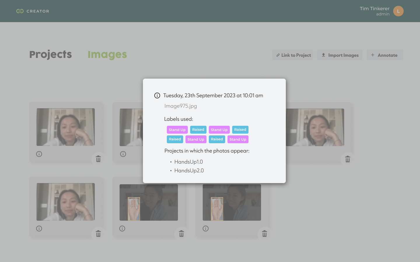
Fig. 03 — Project setup, three detection types.

Fig. 04 — My Models, model evaluation with prediction breakdown.
Rather than designing screen-by-screen, the redesign was anchored on a shared component system that every detection module inherits from.
Common patterns — the project setup modal, the dataset import dialog, the model status table, the training progress indicators, the labels manager, the annotation tool — live in one place and behave the same way across Activity, Gesture, and Spatial workflows. This had two effects: it shortened the learning curve for users who switch detection types, and it gave the engineering team a predictable surface to extend when new model types ship in future releases.
v2.0 isn’t a cosmetic refresh of v1.0 — it’s a different product, and the metrics reflect that.
The flow that took a user from a blank account to a trained, exportable model collapsed from a multi-step expert workflow into a four-step product flow that new users can complete on their own. Internal teams report a meaningful reduction in onboarding time for new ML engineers joining the platform. The component system built for v2.0 has been extended to ship two new detection categories without rewriting the core IA — precisely the “designing for portability” outcome the system was meant to enable.
“Redesigning Creator wasn’t about making AI look easier. It was about getting out of the way of the people who already know how it works.”
The lesson from Creator was about respecting the expertise of the user.
Many design teams approach technical platforms by trying to simplify them — hiding complexity behind progressive disclosure, smoothing out edges that the user actually relied on. With Creator, the better move was the opposite: respect the engineer’s mental model, surface the technical detail they need, and reduce friction only where the v1 product was creating it unnecessarily.
The other lesson was on prioritization. The feedback collected from v1 was extensive; the value came from triaging it ruthlessly against the redesign goals instead of trying to address every comment. The platform shipped with fewer changes than the feedback log demanded — but each change moved a measurable workflow metric.