The redesign of PreAct Technologies’ website was triggered by the company’s recent acquisition of Gestoos — and by the need to integrate two distinct identities and product offerings into a single, coherent web presence.
I started by thoroughly analyzing both brands and their respective audiences, focusing on how to highlight PreAct’s innovative flash LiDAR hardware alongside Gestoos’ AI capabilities — without subordinating either side of the story. The result had to feel like one company, not two companies sharing a domain.
The color palette was chosen to reflect the technological sophistication of both brands.
Dark tones were paired with bright accents to convey innovation and professionalism while maintaining a modern, confident look. The typography uses clean sans-serif fonts that ensure readability across every device and complement the cutting-edge nature of the brand. Together, the type and color decisions create a surface that feels engineered — consistent with what PreAct actually builds.
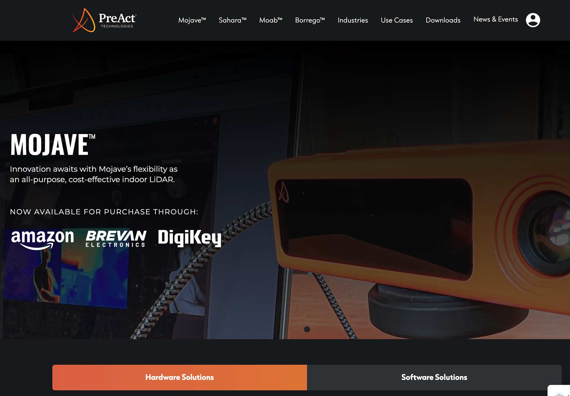
Fig. 01 — Homepage hero, primary navigation across products and use cases.
For a company shipping flash LiDAR sensors and computer-vision software, the visual content layer was as important as the copy.
High-quality product imagery and clear technical diagrams were used to illustrate complex technology in an accessible way. This ensures that both technical and non-technical audiences — engineers integrating the sensors, and the executives signing off on the integration — can engage with the content at the level they need. The layout prioritizes UX by organizing content logically, with clear navigation that adapts across devices.
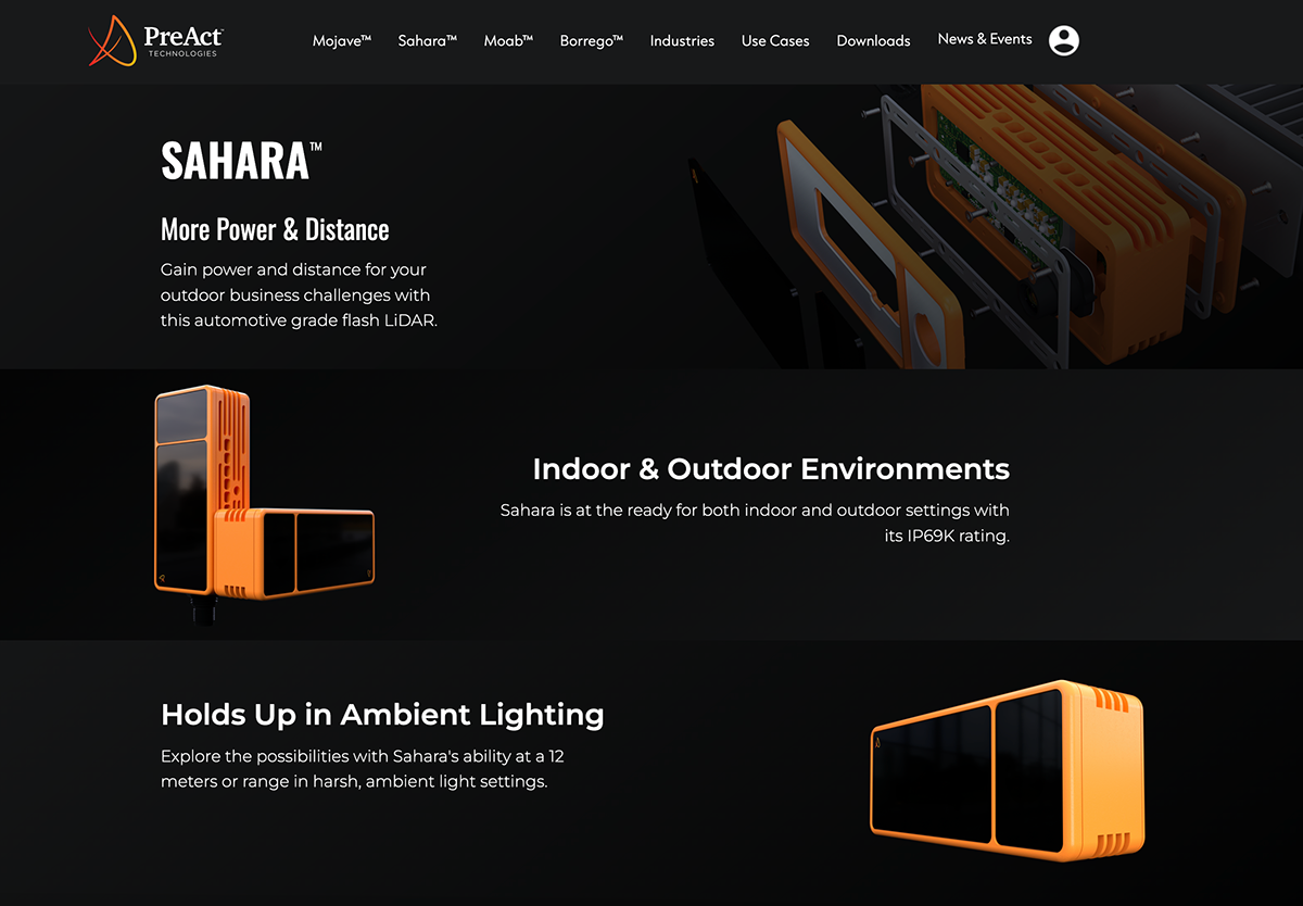
Fig. 02 — Mojave™ product page. “Innovation awaits with Mojave’s flexibility as an all-purpose, cost-effective indoor LiDAR.” Distribution through Amazon, Brevan Electronics, DigiKey.
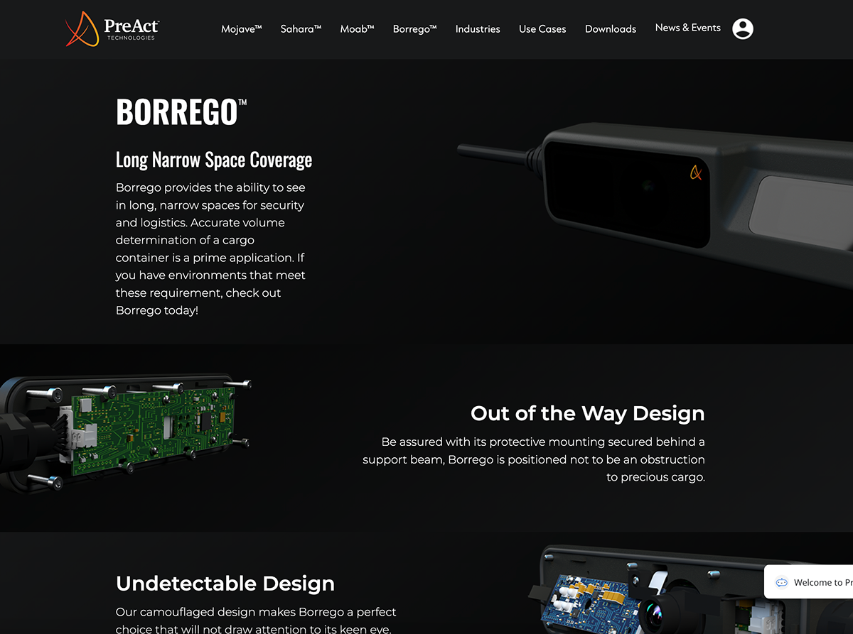
Fig. 03 — Sahara™ product page. Automotive-grade flash LiDAR built for indoor & outdoor environments with an IP69K rating.
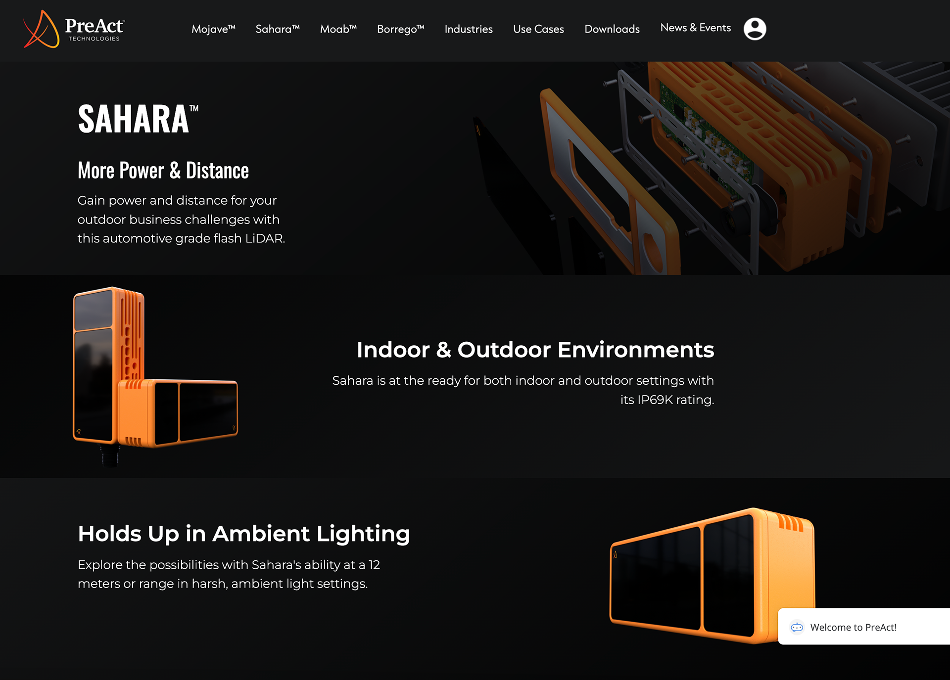
Fig. 04 — Borrego™ product page. Volume detection for cargo containers, designed to mount discreetly behind support beams.
The site’s information architecture was designed to improve usability by giving each product line and technology its own distinct surface.
The primary navigation routes users into the four hardware products (Mojave, Sahara, Moab, Borrego), the cross-cutting Industries and Use Cases sections, the Downloads layer for SDKs and documentation, and a unified News & Events page. The navigation was simplified to let users reach relevant information quickly while maintaining consistency across every page — the same nav, the same footer, the same visual language no matter where you land.
SEO optimization and mobile responsiveness were treated as first-class requirements, ensuring the site performs across organic discovery channels and works flawlessly on every device.
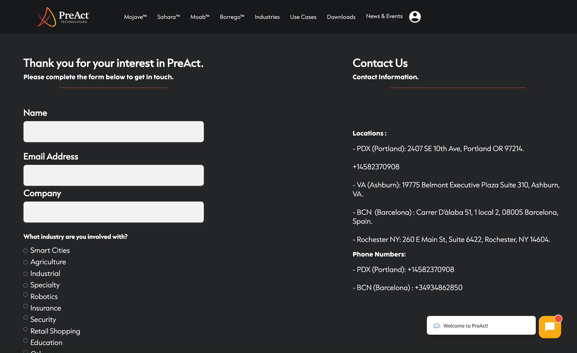
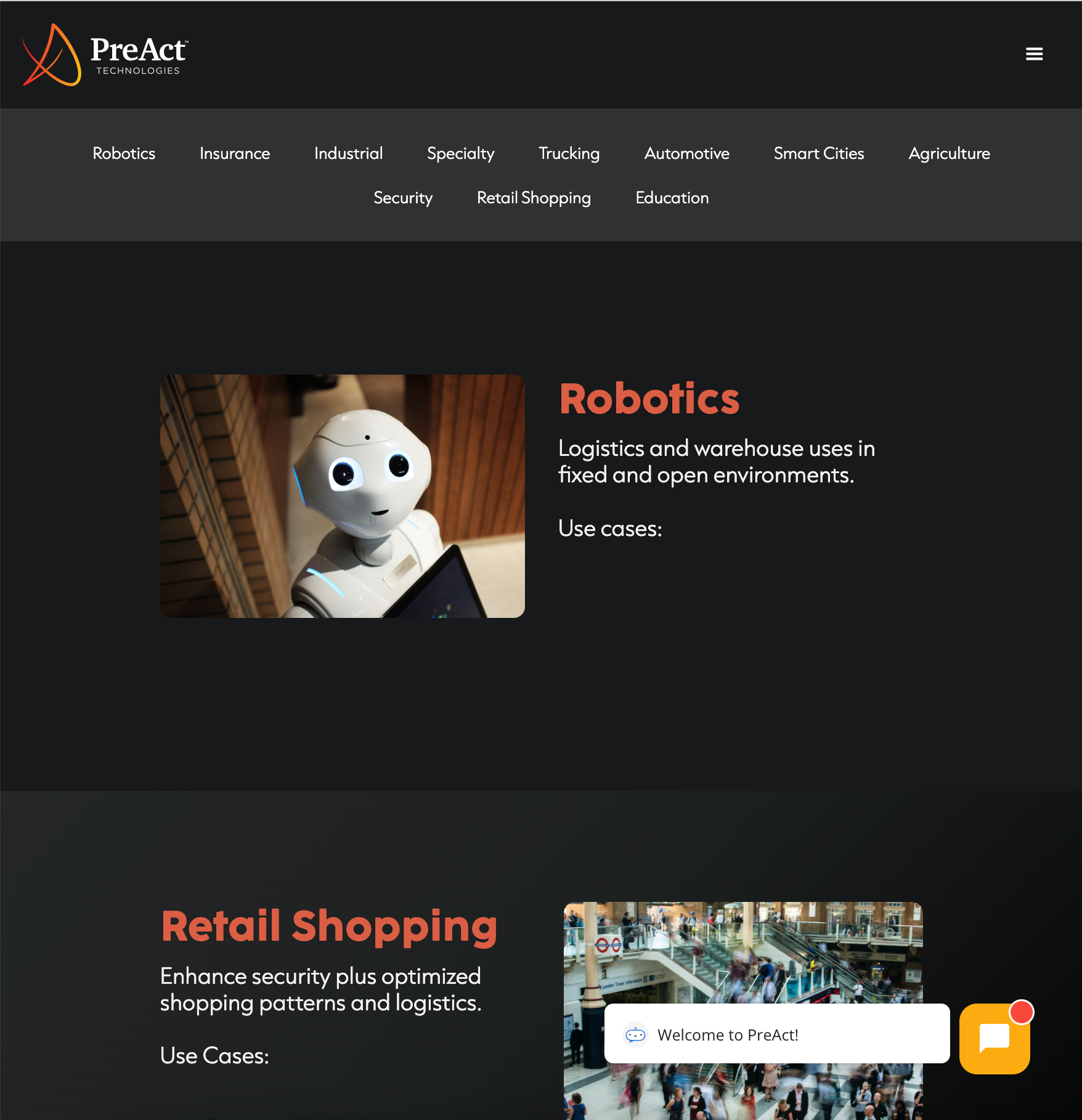
Fig. 05 — Industries page. Eleven verticals: Robotics, Insurance, Industrial, Specialty, Trucking, Automotive, Smart Cities, Agriculture, Security, Retail Shopping, Education.
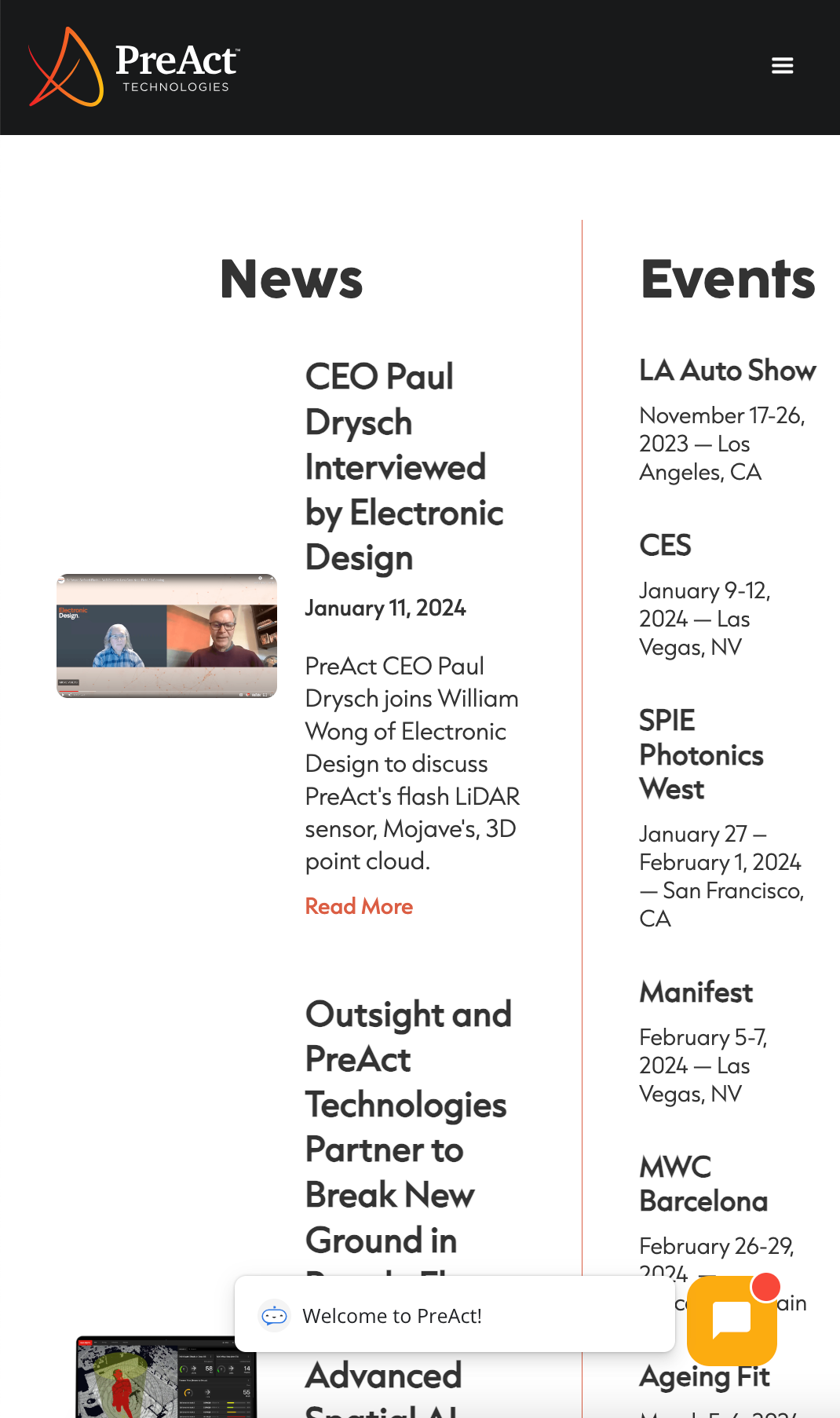
Fig. 06 — Use Cases / Activity Monitoring. Worker Productivity, Safety in Escalators, Safety in Elevators, with computer-vision overlays.
Every redesign decision was tested against an explicit list of requirements covering performance, usability, and brand consistency.
Performance
Loading speed was assessed and optimized across pages — recognizing that website performance directly shapes user experience and conversion on a B2B tech site.
Homepage design
A clean, organized layout with a clear value proposition. Navigation paths surface the most important information within seconds of landing.
Navigation
Menu structure and discoverability were both evaluated and refined. Call-to-action placement was reviewed against real user paths, not just brand wishlists.
Visual appeal
Use of visuals, multimedia, and brand elements was held to a consistent standard across the site. White space was treated as a structural element, not as filler.
Content quality
Written content was reviewed for clarity and relevance. Text and visuals were balanced so that engagement stays high without diluting technical accuracy.
Contact & interaction
Clear contact information — offices in Portland, Ashburn, Barcelona, and Rochester — alongside interactive forms with industry segmentation for inbound lead routing.
Consistency
Design elements remain consistent across every page, and every page aligns with the integrated PreAct + Gestoos brand identity.
Responsiveness
The site adapts cleanly to every screen size and device, with layouts tuned for desktop browsing, tablet review, and mobile-first discovery flows.
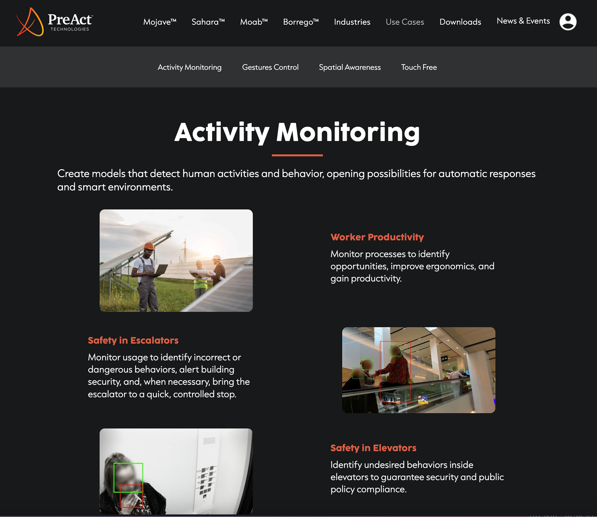
Fig. 07 — News & Events page. Press coverage in the left column, industry events in the right column.
A handful of UX/UI decisions do most of the work in making the redesigned site feel cohesive.
A consistent palette — dark tones with bright accents — reinforces brand identity and projects a professional, technology-first impression across every page.
Bold headings and strategic use of white space guide attention through the content naturally. Users scan first, read second, and act third — in that order.
Layouts adjust seamlessly across desktop, tablet, and mobile, delivering an optimal experience regardless of screen size or context.
High-quality product renders and well-placed visuals enhance engagement and clarify complex technology — especially for visitors arriving without prior context on flash LiDAR or computer vision.
Fig. 08 — Contact page. Industry segmentation in the form, four office locations on the right.
The full system was designed in Figma and implemented in Webflow — a stack chosen for design parity, fast iteration, and post-launch maintainability.
Webflow lets the PreAct marketing team manage news, events, downloads, and minor copy changes without engineering involvement, while the design system stays under design control. The redesign effectively merges the brand identities of PreAct and Gestoos, offering a cohesive and visually engaging experience that supports the company’s long-term business objectives.
The new site went live in 2024 and has been the company’s primary commercial surface since.
Three improvements stand out post-launch. Organic discovery improved meaningfully — the technical SEO foundation (clean information architecture, semantic markup, structured data, optimized image delivery) was treated as a first-class requirement rather than an afterthought, and the site now ranks for both PreAct hardware terms and Gestoos AI terms from the same domain. Page-speed scores cleared the Core Web Vitals thresholds across all key product pages, which matters for both SEO and the impression a B2B technical buyer forms within the first three seconds. And the unified inquiry form with industry segmentation now routes leads directly into the relevant business line — consolidating what used to be two parallel sales pipelines into one.
“Two brands. One web presence. The integration was the project.”
The lesson from PreAct + Gestoos was that the design problem in an acquisition is rarely visual.
The visual integration is the easy part — pick a palette, pick a type system, ship a consistent header. The hard part is the editorial integration: deciding which products lead, how to talk about the joined offering, and how to position the combined company against the markets each brand was already serving separately. Most of the redesign decisions were really information architecture and copy decisions that the visual layer simply made visible.
The other lesson was about long-term ownership. By building on Figma + Webflow, the site stays editable by the team that maintains it — which is the only way a launch turns into a living website rather than a static milestone.