Yanex Sàrl is a Swiss-based spirits distributor with a curated portfolio of premium beverages — including the Paderewski vodka line and the Lubuski gin range — positioned for the high-end European market.
The brand needed a digital surface that matched the quality of the bottles themselves: a website capable of presenting the full product range with editorial precision, reinforcing the brand’s positioning in the Swiss market, and giving distributors, on-trade clients, and end consumers a single, credible point of contact.
I owned the project end to end — from information architecture and visual system through the full WordPress build — designing in Figma and implementing the production site in custom HTML, CSS, and PHP.
Before designing a single screen, I defined three business objectives that every later decision would be tested against.
Showcase the full beverage range with editorial detail — each product introduced through high-quality visuals and structured descriptions that highlight provenance, distillation, and tasting notes. Navigation between categories (Vodka, Gin, Cocktails) had to feel like flipping through a well-designed catalogue, not browsing an e-commerce grid.
Reinforce Yanex’s positioning in the competitive Swiss premium-spirits market. The site had to operate as a digital extension of the brand — every type choice, color, and layout decision reading as “considered” rather than templated. The goal was to leave a clear impression of heritage, prestige, and quality, especially for first-time visitors.
Build engagement loops that bring visitors back. Social integration, product pairing suggestions, and a dedicated cocktail recipe section turn the site from a static brochure into a small ecosystem around the brand — one that gives customers a reason to return and share.
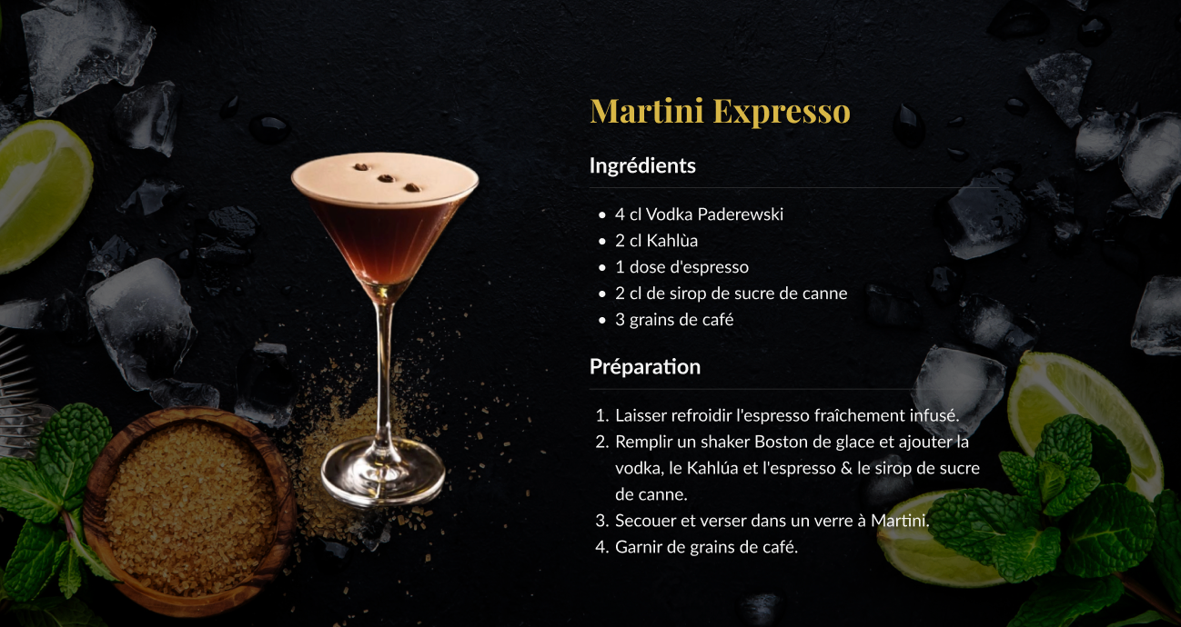
Fig. 01 — Homepage, full-width hero, vodka and gin entry points.
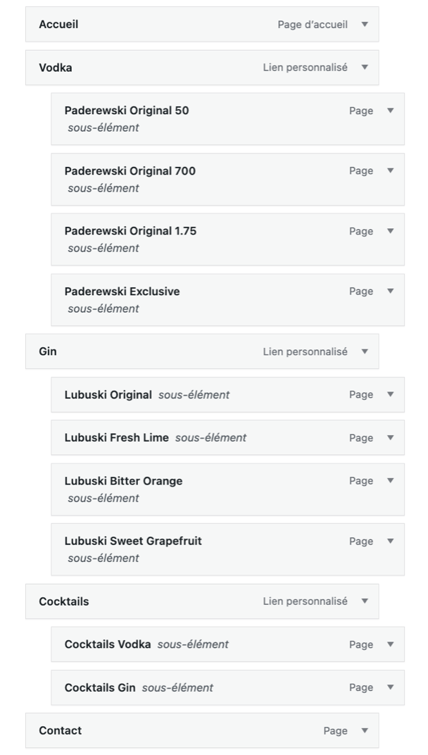
The site is organized around three primary categories — Vodka, Gin, Cocktails — and a Contact entry point, with nested product pages under each.
Each subcategory routes to a dedicated product page with full editorial detail: Paderewski (Original 50, Original 700, Original 1.75, Exclusive) under Vodka, and Lubuski (Original, Fresh Lime, Bitter Orange, Sweet Grapefruit) under Gin. Cocktails are split into Cocktails Vodka and Cocktails Gin to mirror the product structure and reinforce the relationship between bottles and recipes.
The result is a navigation system that’s logical without being clinical — users can reach any product or cocktail in two clicks, and the architecture quietly supports future expansion into new spirits, markets, or seasonal collections.
The type system pairs a classical serif with a clean humanist sans — a deliberate combination chosen to anchor the brand in editorial tradition while keeping the reading experience modern and effortless.
A refined serif with high-contrast strokes and graceful terminals. Used for hero statements, product titles, and section headers, it carries the weight of print typography into the digital build and signals heritage at first glance. It establishes hierarchy instantly: when Playfair appears, the eye reads “this matters.”
A modern humanist sans with open counters and slightly rounded forms. Optimized for screen rendering across resolutions, it carries long-form content — product descriptions, recipe steps, brand storytelling — without strain. The warmth in its letterforms keeps the body copy approachable, balancing the formality of Playfair above it.
The contrast between serif headlines and sans body text creates a sharp visual hierarchy that users navigate without conscious effort. Aesthetically, the combination lets the design feel simultaneously classic and contemporary — the right register for a premium spirits brand that wants to read as heritage-driven but not dated.
The palette uses three values, each selected for a specific functional reason as much as for the aesthetic outcome.
Using #141414 instead of #000000 and #F5F5F5 instead of #FFFFFF reduces the harshness of maximum contrast. Pure black-and-white pairings, while attention-grabbing, cause visual fatigue during long-form reading and can be aggressive on high-brightness screens. The softened tones preserve the impact of the dark palette while keeping the reading experience comfortable.
Maximum-contrast palettes can also be physically uncomfortable for users with light sensitivity or certain visual impairments. The refined off-white-on-near-black contrast still passes accessibility thresholds for body text while remaining legible across a wider range of conditions and devices.
#D4AF37 appears sparingly — cocktail recipe headings, key call-to-actions, product highlights — never as a surface color. Used this way, it carries the prestige signal without overwhelming the page. It also functions as a visual anchor: the eye learns within seconds that gold means “this is where the brand wants you to look.”

Fig. 02 — Product detail page, vodka line.
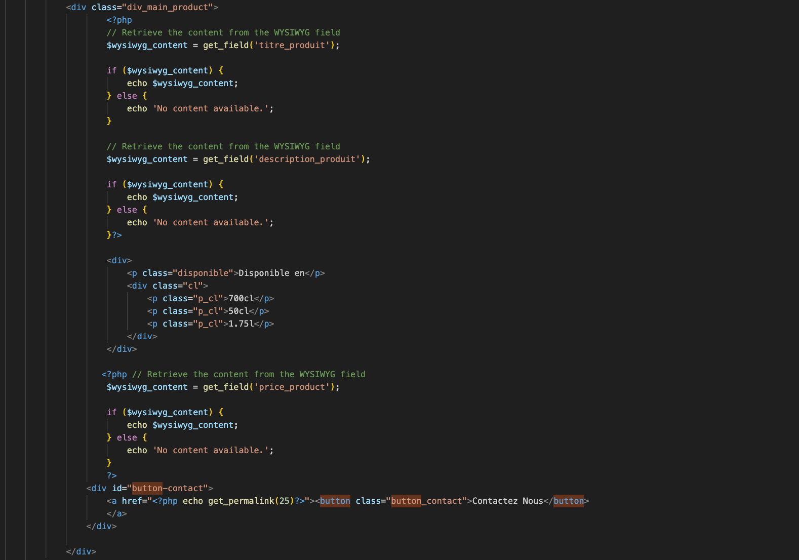
Fig. 03 — Cocktail recipe page, gold accent in headings.
The content was structured to communicate quickly and stay engaging on repeat visits.
Product descriptions are deliberately short and structured — provenance, character, suggested serve — so visitors absorb the essentials in seconds. High-quality product photography carries the brand at every scroll position; the visuals do the persuasion the copy doesn’t need to. The cocktail library adds the long-tail content that gives the site editorial depth and a reason to keep coming back, with each recipe formatted consistently for ingredients, preparation, and serving suggestion.
Across the entire site, the writing tone stays restrained and confident — consistent with the brand’s premium positioning, never overselling.
The site is a custom WordPress build — not a theme. Every template, layout, and component was written by hand to match the design system and to give the client a maintainable, scalable platform.
Hand-written HTML defines all the static surfaces — brand history, cocktail recipe shells, structural components — ensuring consistent rendering and removing dependency on any third-party page builder. This layer is intentionally stable: it doesn’t change unless the brand changes.
PHP handles everything that needs to update over time — product entries, recipe content, dynamic imagery, navigation, and shared components (header, footer, menu). I used WordPress’s native query and template functions together with Advanced Custom Fields (ACF) to surface structured content into the layouts. New products and recipes can be added without touching code: the client updates fields in the WordPress admin, and the front-end renders them through the existing PHP templates.
Common elements — header, footer, navigation, recipe cards — are written once as PHP partials and included across the site. This keeps the build DRY, the maintenance cost low, and the visual consistency tight by construction.
The site is image-heavy by design, which means responsive behavior couldn’t be left to a generic grid framework. I built the CSS as a mobile-first system with four dedicated stylesheets, each tuned for a specific viewport range.
Because the brand lives on its imagery, each breakpoint is calibrated against the photography library — bottle compositions, cocktail shots, lifestyle scenes — to make sure cropping, focal points, and visual hierarchy hold across every screen size.
“A premium brand fails silently when its website doesn’t hold the same standard as its product.”
Yanex was the project where the design discipline and the engineering discipline had to share one calendar.
Designing in Figma and then writing the production code myself meant every visual decision was tested against its real implementation cost on the same day — an immediate feedback loop that I’d keep on every brand build going forward. It also let me design components that take full advantage of CSS rather than fighting it.
The other lesson was on architecture. By doing the IA work upfront and pairing it with a WordPress + ACF setup, the client can scale the site themselves — new products, new recipes, new collections — without coming back to a developer for routine content work. The most valuable thing I shipped wasn’t the launch site; it was a system the brand can keep running on its own.